Background
My previous work on SystemLink laid a strong foundation for tackling the table component within the design system. Small-scale implementation efforts had already adopted many of my ideas for optimizing usability and functionality. This hands-on experience provided valuable insights into the complexities and nuances of designing effective table-based interfaces, shaping my approach to creating a standardized table component.
Research
We conducted interviews with client product teams to gather feedback on their table usage, feature priorities, and desired enhancements. These interviews provided qualitative data that informed the creation of a comprehensive project plan, outlining key milestones and feature priorities derived directly from user input.
Learnings
Focus areas for most tables
- Column flexibility
- Content flexibility
- Performance
Critical areas for some tables
- Grouping
- Hierarchy
primary interactions
- Filtering and searching
- Column manipulation
Priorities
Support SystemLink Enterprise workflows
- Parity functionality
- Hierarchical data support
Introduce modern interactions & experiences
- Direct manipulation
- Accessibility
Provide features for other products & web apps
- Pagination
- Editable cells
Exploration
From the interviews, we identified several “how might we” questions and created user flows from them. I collaborated with a visual designer to create interactive prototypes exploring these concepts, and they were presented back to clients to set expectations and solicit feedback.
- How might a user start with a table of 1000s of items and take an action on a subset of them?
- How might a user edit a single item?
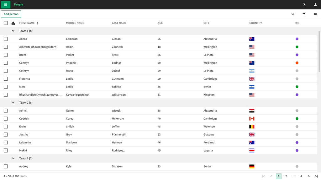
- How might a user group and browse large amounts of content?

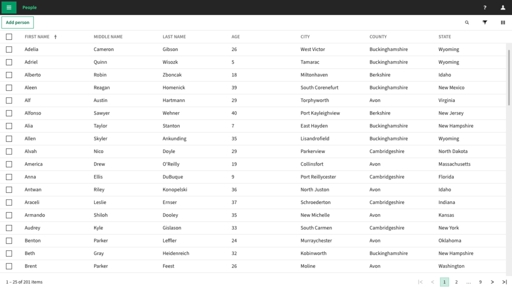

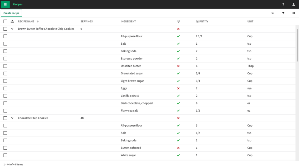
One of the primary workflows we focused on was reducing and organizing data for action and discovery. In SystemLink, the end-user had to configure sorting and grouping in a slide out before committing to view changes. We wanted to ensure that the simple version of that experience was available immediately in the grid without taking up any additional vertical space on the page, so we explored different overlays and dropdowns from the column header.
Interactions
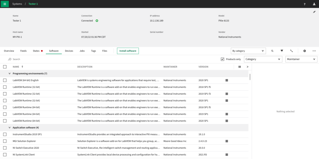
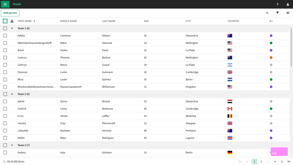
The first table component milestone I worked on focused on basic interactions. End-users need to be able to sort, resize, and reorder columns and select, group, and collapse rows in a table via mouse or keyboard interaction in order to meaningfully find and view their data. These features were needed for parity with existing product tables and provided us with the opportunity to improve on known deficiencies such as accessibility.
I did a survey of keyboard navigation used in external product and component library tables/grids. This was particularly important for accessibility and keyboard navigation, because the W3C ARIA guidelines do not cover all our use cases—and we learned from speaking with the Accessibility Coordinator at the Texas School For The Blind and Visually Impaired that “people don’t have a lot of expectations [of grids] other than they’re usually coded poorly and they don’t work.”
- OneDrive
- SharePoint
- Azure DevOps
- Telerik
- MUI X
I interrogated the concepts from the prototypes, wireframing each micro-interaction to determine where they succeeded or failed and what additional design decisions needed to be made. As decisions were made and reviewed, wireframes were updated and arranged into discrete user task flows. From these flows, I was able to not only determine which mouse operations required keyboard support but also use the click interaction models to inform decisions such as what receives focus and how focus is received. Specifications were created using the wireframes and any additional drawings necessary to ensure that developers had the information they needed to accurately implement the interaction design for both mouse- and keyboard-based table interactions.
As development progressed, I remained actively involved in refining the design recommendations to accommodate technical constraints and evolving requirements. Regular design reviews and discussions helped address any emerging challenges and fostered a shared understanding among team members.
Keyboard navigation was something we frequently revisited, weighing the pros and cons of different approaches (such as the ARIA guidelines for grid versus treegrid), with the decision still in draft as of 2024.
Lessons learned
- Complex components like the table requires more in-depth stakeholder engagement to ensure we aren’t designing for a single product
- Flexibility, innovation, and proactive problem-solving are needed to overcome technical obstacles based on specific technologies
- Weighing the significance of each feature or enhancement against overarching project goals is necessary for strategic design prioritization amidst competing constraints and limited resources
Next steps
- User testing and validation
- Accessibility enhancements
- Feature expansion
- Comprehensive documentation
Unfortunately, we lost our product owner in the middle of implementation and later I was not at the company to move forward with any next steps.