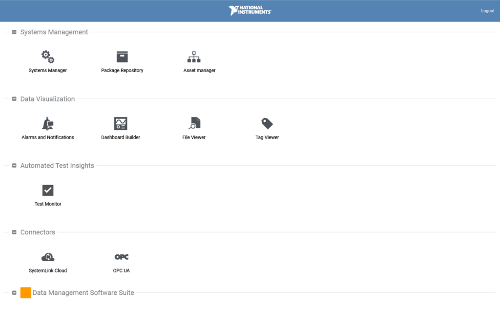
Background
When I joined the SystemLink team, I got started designing a tile-based dashboard building experience. I had just finished working on resizable web panels for LabVIEW, a much more technical and complex environment. Transitioning to this new project provided a fresh perspective and strategic shift towards more intuitive, adaptable, and modern interfaces and interactions. Through iterative exploration and collaboration with stakeholders, I aimed to streamline dashboard creation while setting the stage for broader design improvements across the platform.
Analysis
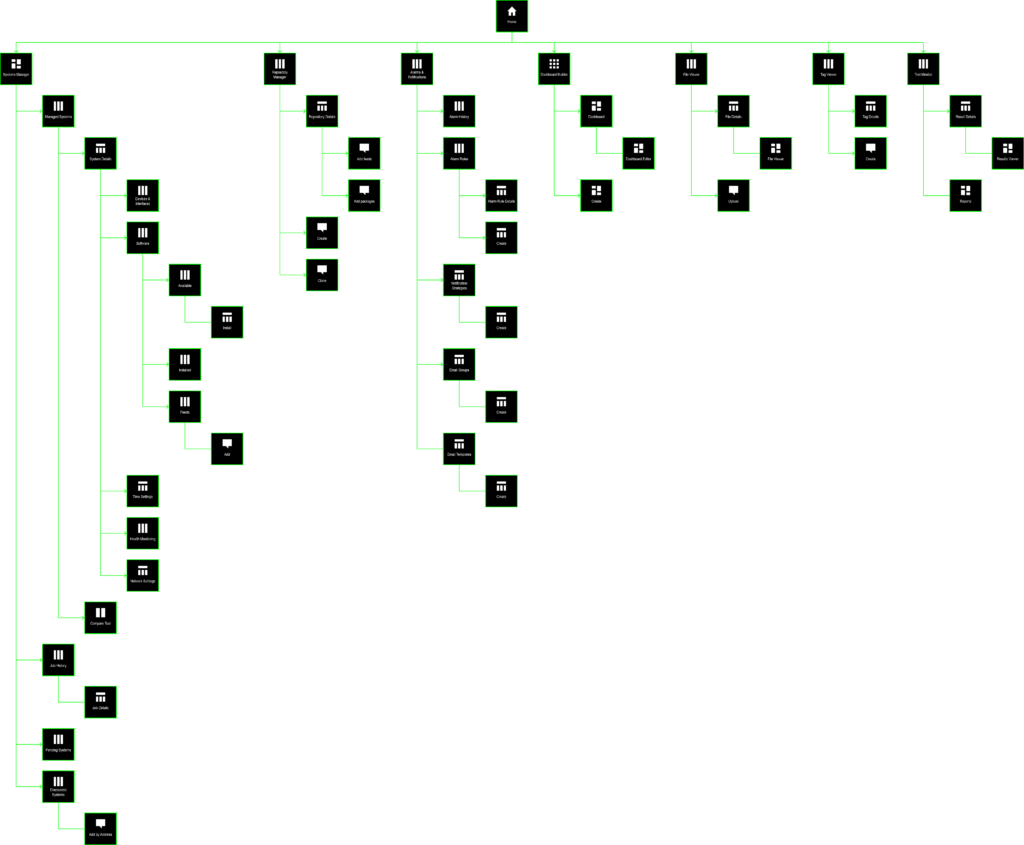
I conducted a review of the current platform, focusing on its interface, functionality, and user interactions. Through this analysis, I identified pain points, usability issues, and areas of inconsistency or inefficiency. Using techniques such as creating a sitemap and documenting workflows with screenshots, I gained a holistic understanding of the platform’s structure and user journeys. Additionally, I gathered valuable insights from stakeholders and team members into their experiences and perspectives. Based on heuristic assessments, I distilled this research into four high-level design goals:
- Structure content to better support the workflows and needs of different users
- Promote high-level functionality and make it easy to switch between apps
- Leverage patterns that maximize content per page and minimize the breadcrumb problem
- Meet the needs of all application teams while maintaining consistency across the product
Exploration
To address these design goals, I delved into research on design patterns, best practices, and innovative solutions used in similar platforms or products. This exploration phase involved wireframing various design concepts to spark new ideas and approaches. Collaborative brainstorming sessions with cross-functional team members also enriched my understanding and generated diverse perspectives. By aligning our efforts with the high-level design goals, we fostered creativity and innovation in our pursuit of enhancing the platform’s user experience.
Design
Synthesizing findings from the analysis and exploration phases, I identified key areas for improvement, focusing on navigation efficiency, information architecture clarity, and optimizing user task flows. To validate my concepts, I developed high-fidelity future-vision wireframes showcasing new patterns across multiple applications. These wireframes were presented to product owners and leadership for feedback and buy-in. I then collaborated with application teams to devise strategic implementation approaches for staging proposed UX enhancements.
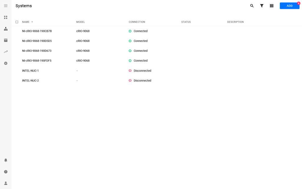
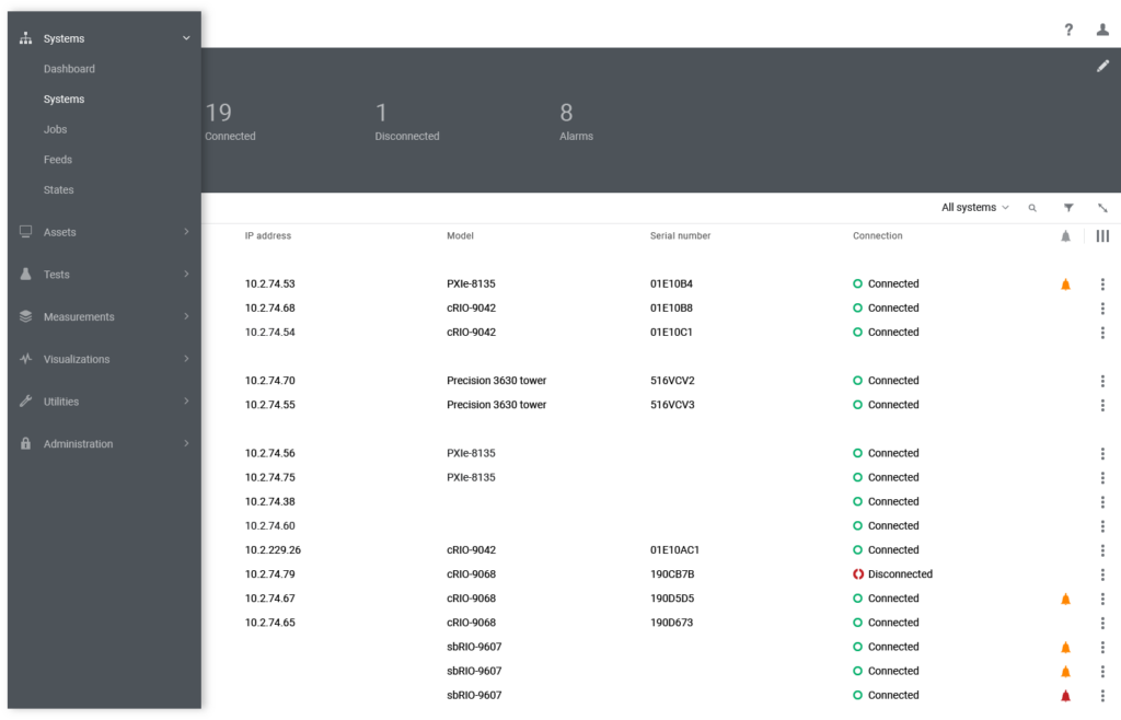
Navigation drawer
Requiring users to click back to the home page to navigate between top-level applications was inefficient. I proposed a left-hand navigation drawer to streamline cross-application workflows, and collaborated with product owners and planners to finalize the navigation schema.
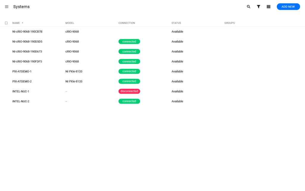
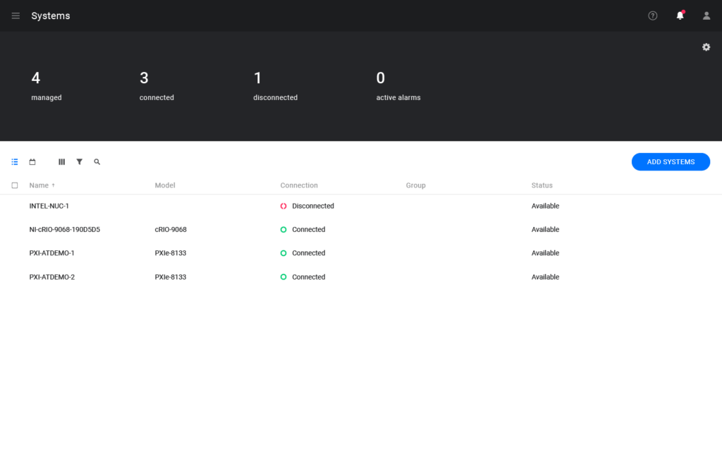
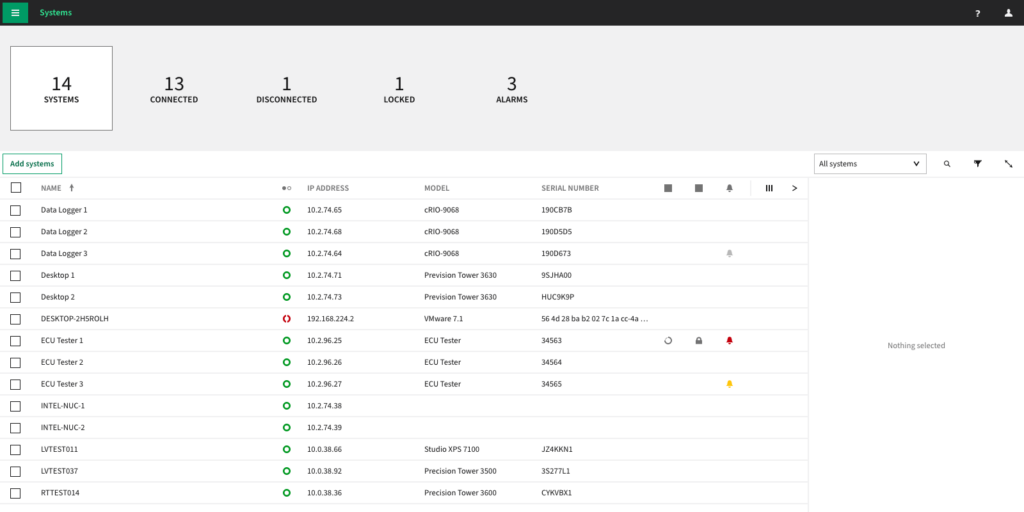
Aggregates pane
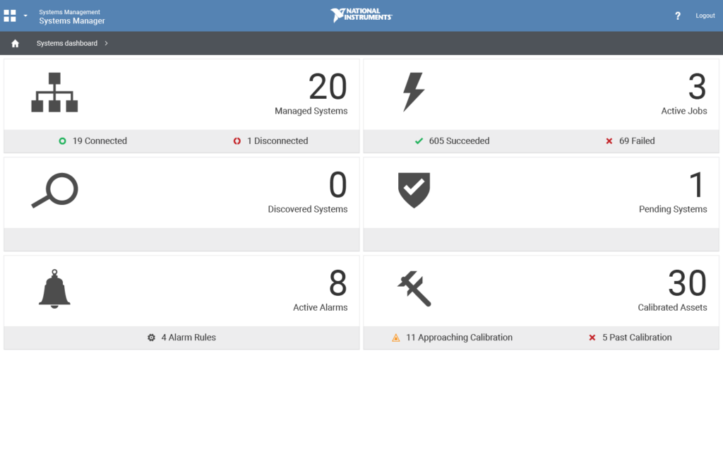
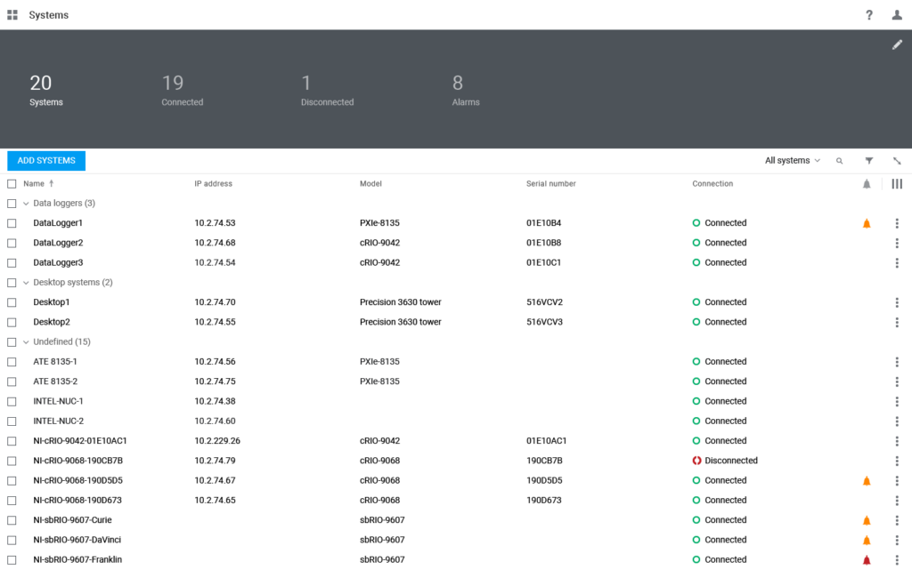
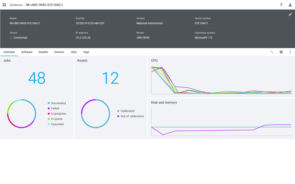
Not all users needed or wanted to see a summary dashboard before navigating to their desired destination. I introduced the concept of the aggregate pane to top-level grid views to combine both experiences on the same page.
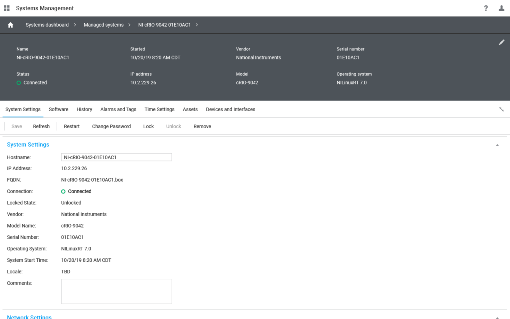
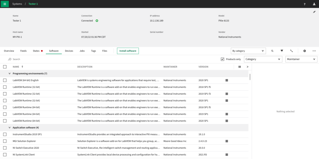
Details pane
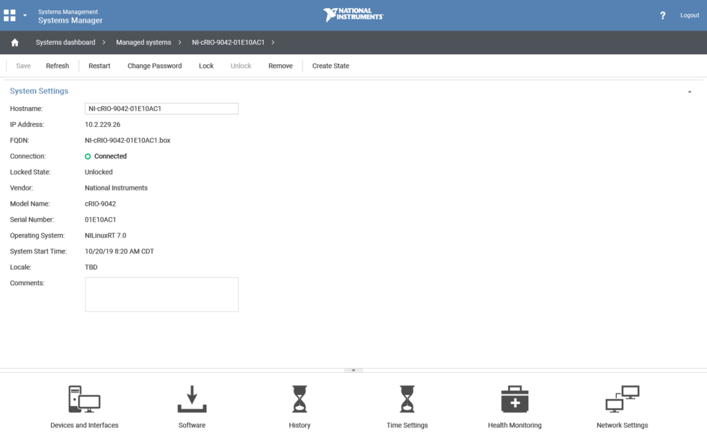
Users had to rely on recall for certain details that may be relevant when drilling down. I adapted the pane to display parent properties above all tab views, and designed a configuration interface for user customization.
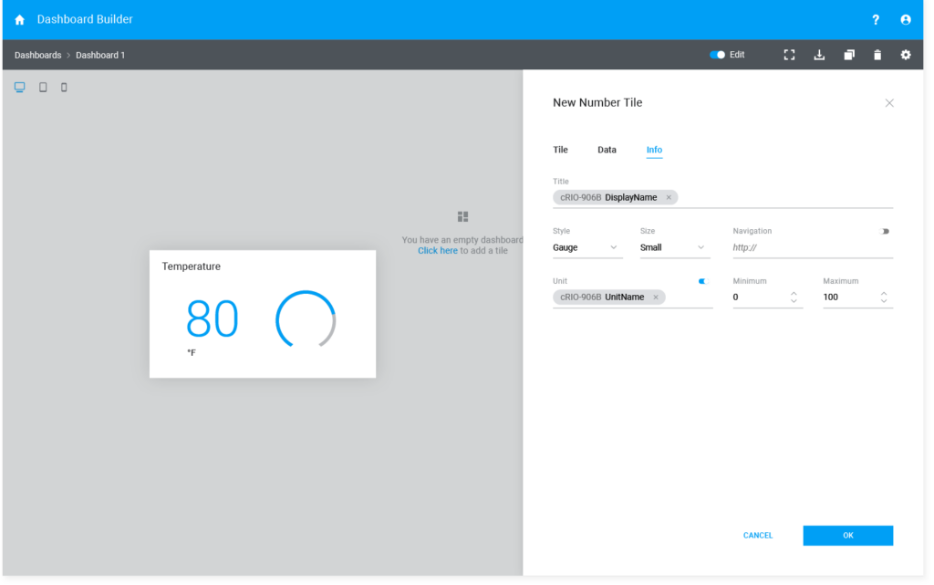
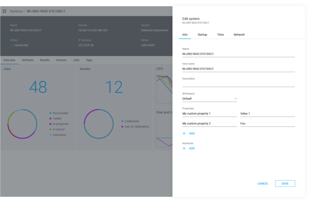
Slide outs
Users did not need access to all interfaces with the same frequency or priority. I improved user focus on primary workflows by separating configuration options into slide outs, available on-demand from both top-level grids and details page tab views.
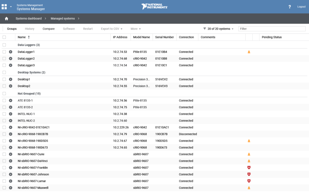
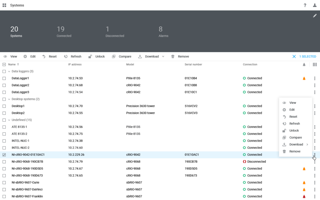
Action buttons
Both action and command buttons were persistent in the UI, including contextual actions that remained disabled until row selection. I introduced a primary action button and designed a toolbar that dynamically changed on selection. I also added context menus to each grid row, and made actions available from details pages.
Refinement & implementation
Following the initial proposals, I continued refining high-level UX patterns to improve them and ensure they accommodated more detailed use cases as they arose. As applications got more complex, I was able to stress-test the patterns as part of my project work.
Redesign efforts were initiated on a team-by-team basis, often coinciding with redevelopment efforts. One exception was the navigation drawer project, which required cross-application collaboration. Most applications implemented slide-outs and aggregate and/or details panes, leading to code-sharing and the beginnings of a component library that eventually led to the creation of a design system. When an enterprise offering was proposed in 2020, it was architected with new platform framework, allowing much more comprehensive and consistent implementation of my designs.
Lessons learned
- Identifying opportunities for creative problem-solving while ensuring that our designs remained viable enabled us to deliver solutions that were both innovative and practical
- Resilience and adaptability can overcome obstacles like technological limitations, resource constraints, and budget disruptions
- Designing with scalability and long-term sustainability in mind is just as important as designing new features
Next steps
In 2022, my role evolved to a deeper involvement in the design system. As focus shifted towards enterprise offerings, I gradually transitioned to a full-time member of the design system team, relinquishing my direct involvement with SystemLink. However, I continued to provide extensive demos, guidance, and critique to other SystemLink designers working within my patterns and solutions. This collaborative effort aimed to ensure consistency and coherence in UX design practices across the SystemLink platform, despite my shifting responsibilities.